Website
Mazda 2038
Mazda's website was needing an update back in 2014 and I was lucky to be part of a small team that got to design and build the brand's local website. This project revisits a decade ago's brief, and applies today's visual design standards to the same information architecture and content strategy.
The website was needing to communicate more effectively the brand's key values: Japanese innovation, design and technology. In this version I proposed a more minimal and clean art direction that could enhance the product and allow it to take center stage. Mazda is recognized for having amazing design and top class vehicles. I replaced the brand's models with generative AI assets to reflect a vision of an even further future and I also took some liberties regarding the brand guidelines.
Year: 2014 (original and commercial) and 2024 (remake and personal version)
Client: Mazda Colombia by Proximity BBDO
Role: Web Designer
Content update: Sept. 24, 2024
Responsive web design
Probably the first objective was to design the website so that it could be fully responsive. Although the site had no direct sales in its functions, it was definitely important that potential buyers could access the information in any device as part of their overall CUJ (Customer User Journey).
Initial design phase
UX Design
A team of content designers would establish content strategy, considering a how customers would navigate the site through a funnel, ending in lead generation and contact. This strategy enabled a clear information architecture to be put in place.
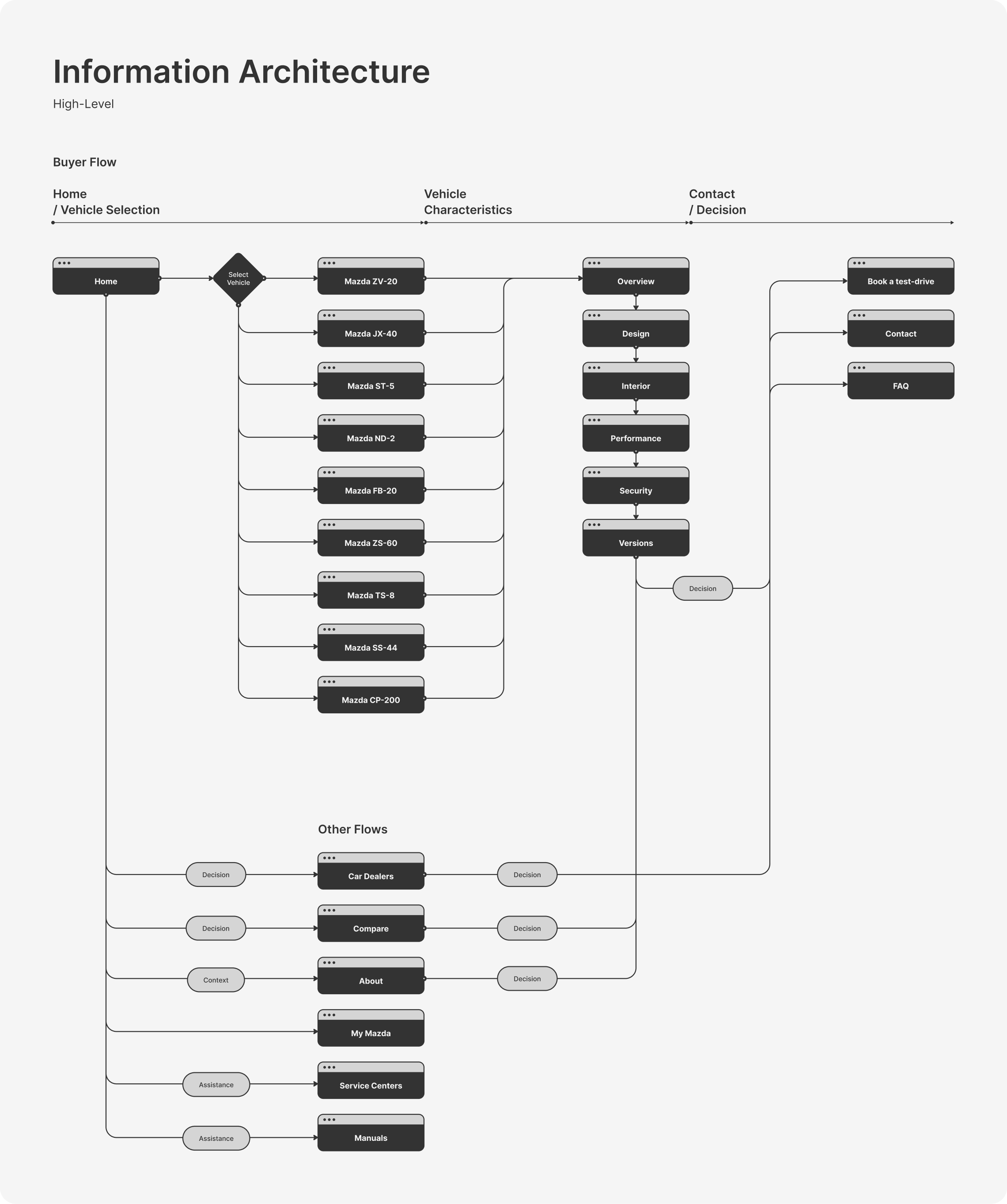
Flow designed for conversion
The team optimized a very large set of information so that it could be organized in the most streamlined way so that we could automate as much as possible in the very little amount of time that we had.
Design System
A minimalistic and clear Design System
So that the site could have a fresh start, building a complete design system was necessary, so that consistency was embedded into the overall website's design.
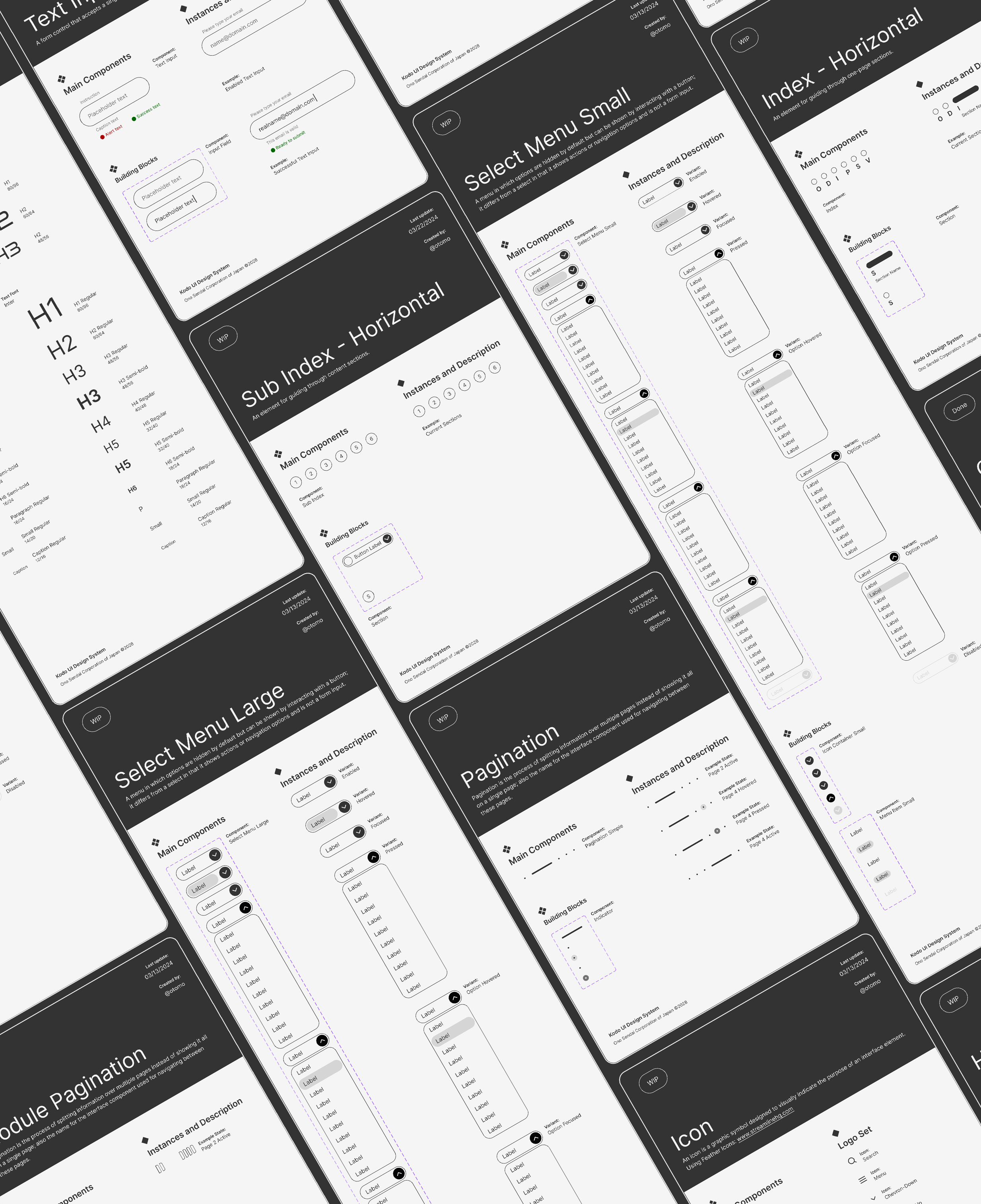
Foundations and Components
From the bottom up, starting with foundations such as color and text styles, all components from small to large were designed with an Atomic Design approach.

*This project is self-initiated and does not attempt to imply that it is real. It is in no way real and does not represent the brands mentioned.
UI Design
The main idea was to let the vehicles take center stage by using a clean UI design. The way in which the information was accessed through the UI and navigation was a way to communicate the brand's hi-tech character. Those two layers defined the site's look & feel.
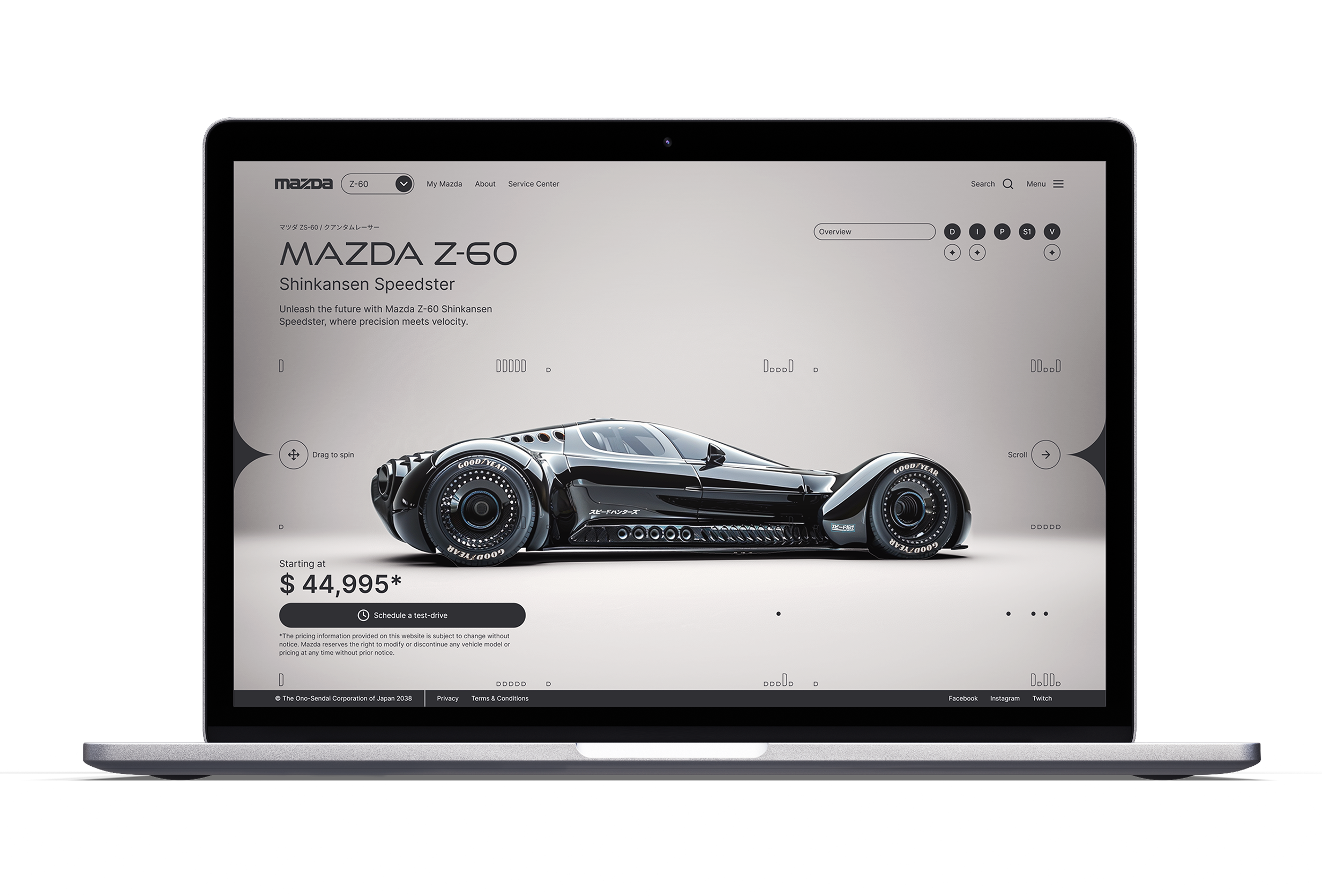
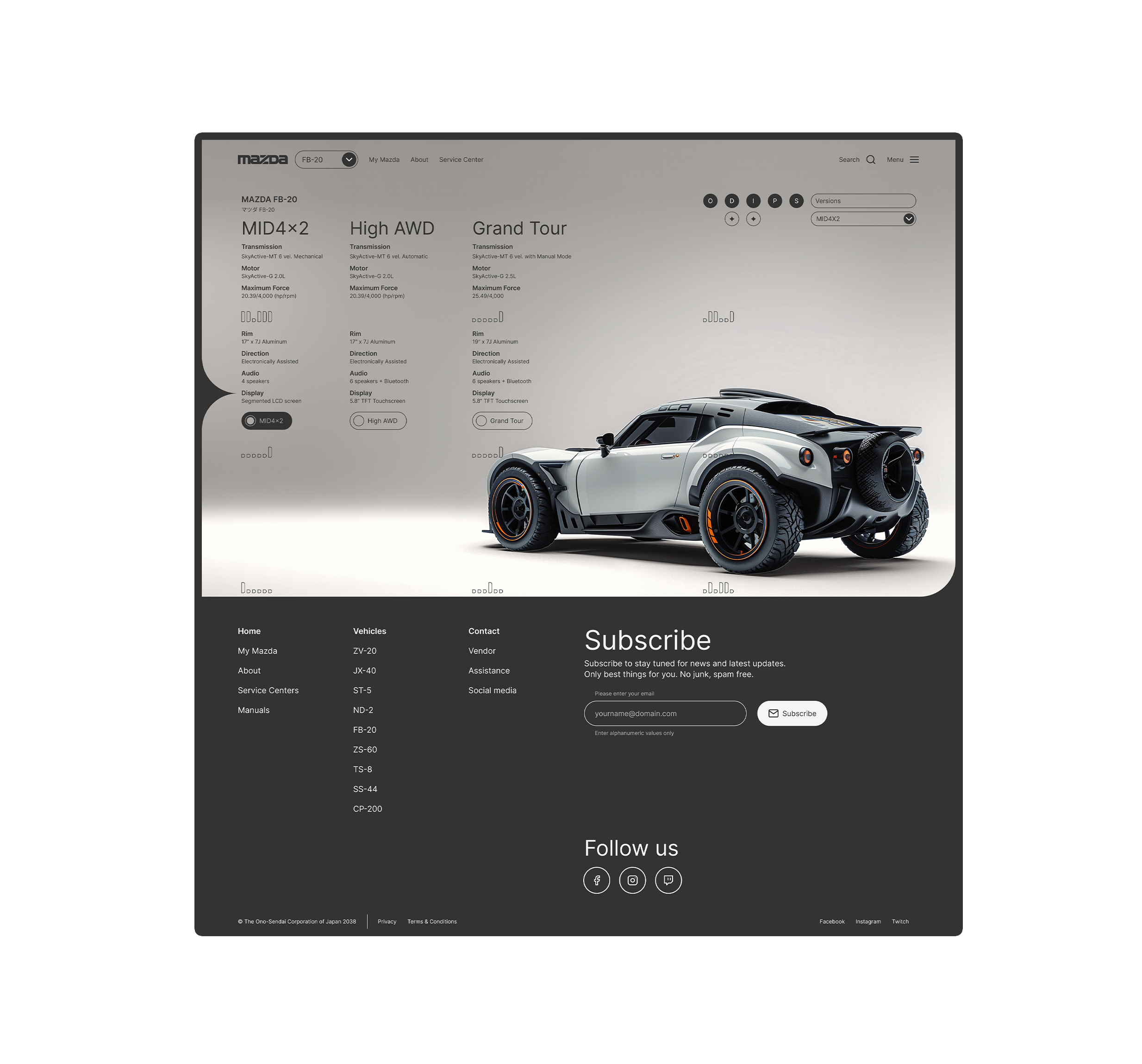
Desktop Version
Larger screens allow for the experience to be more immersive and show each vehicle with greater detail. Although having more area allowed more space for imagery, it was still important to avoid clutter with excessive information.
Also, although users scrolled up and down with their devices, the movement and scroll really happens horizontally, althought the vehicle is mostly still. It is the information surrounding it, in the UI, that changes.
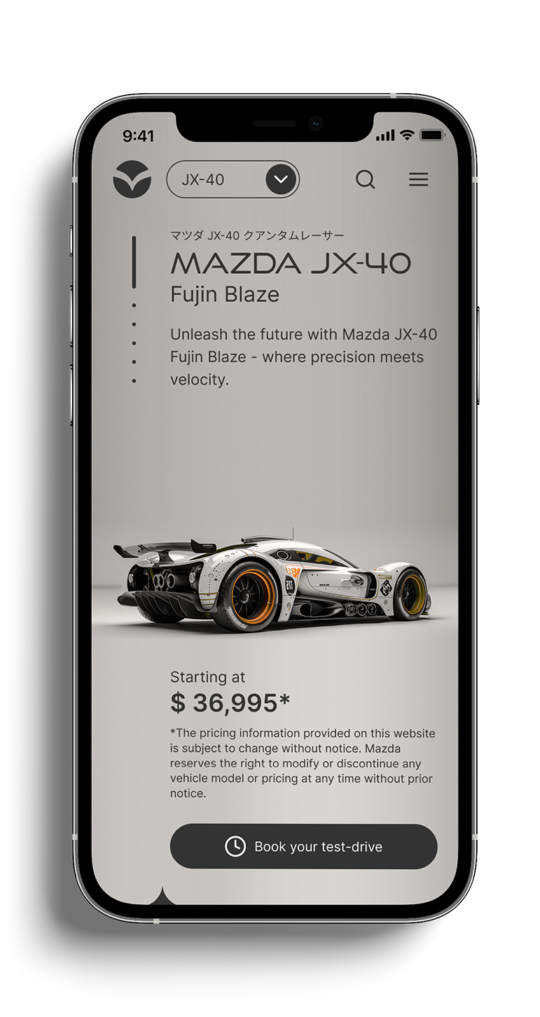
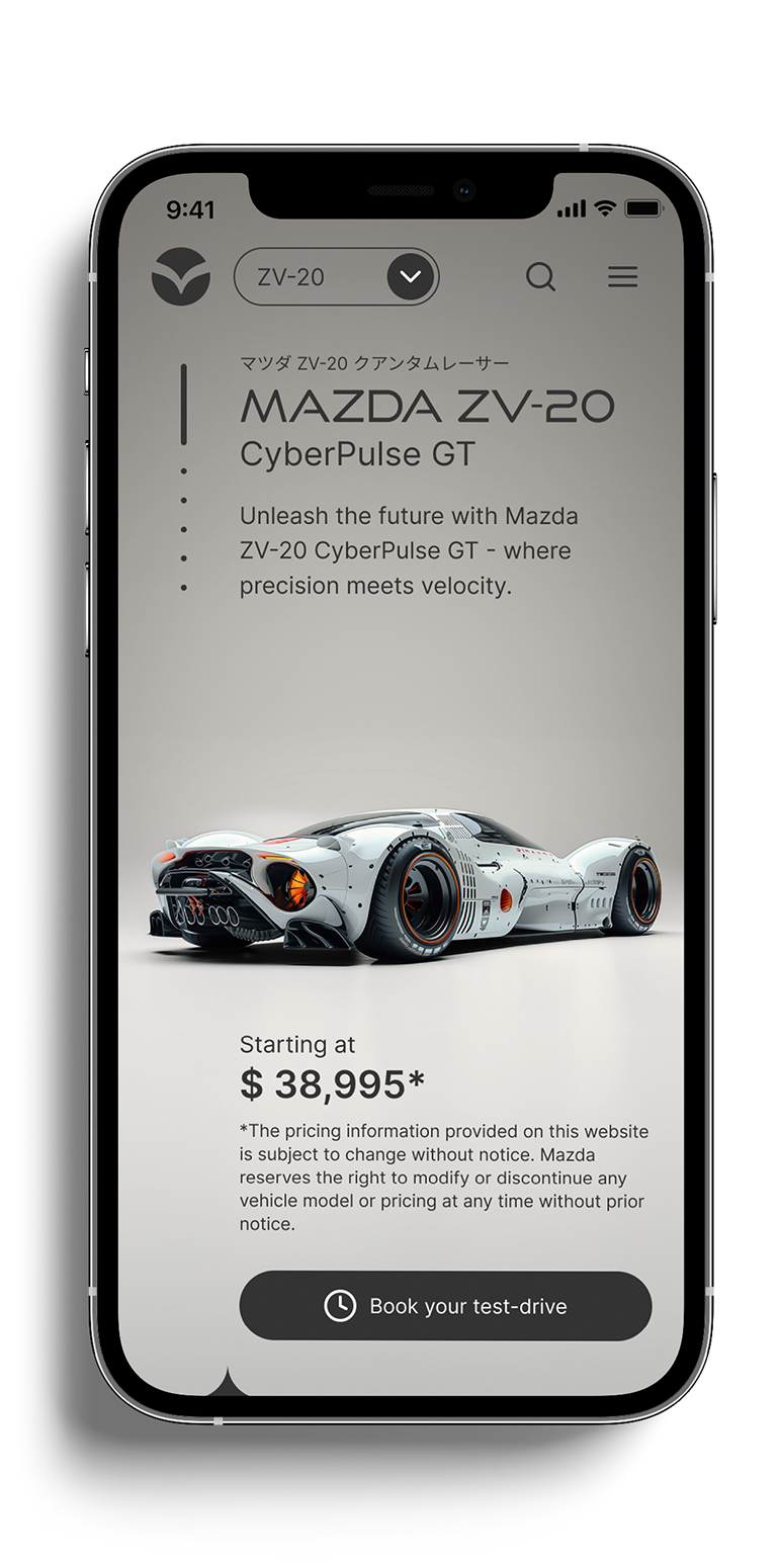
Mobile Version
Fitting large sets of information into a mobile device screen is complex, so it becomes important to optimize the text and figure out ways in which the information can be show at the user's request.
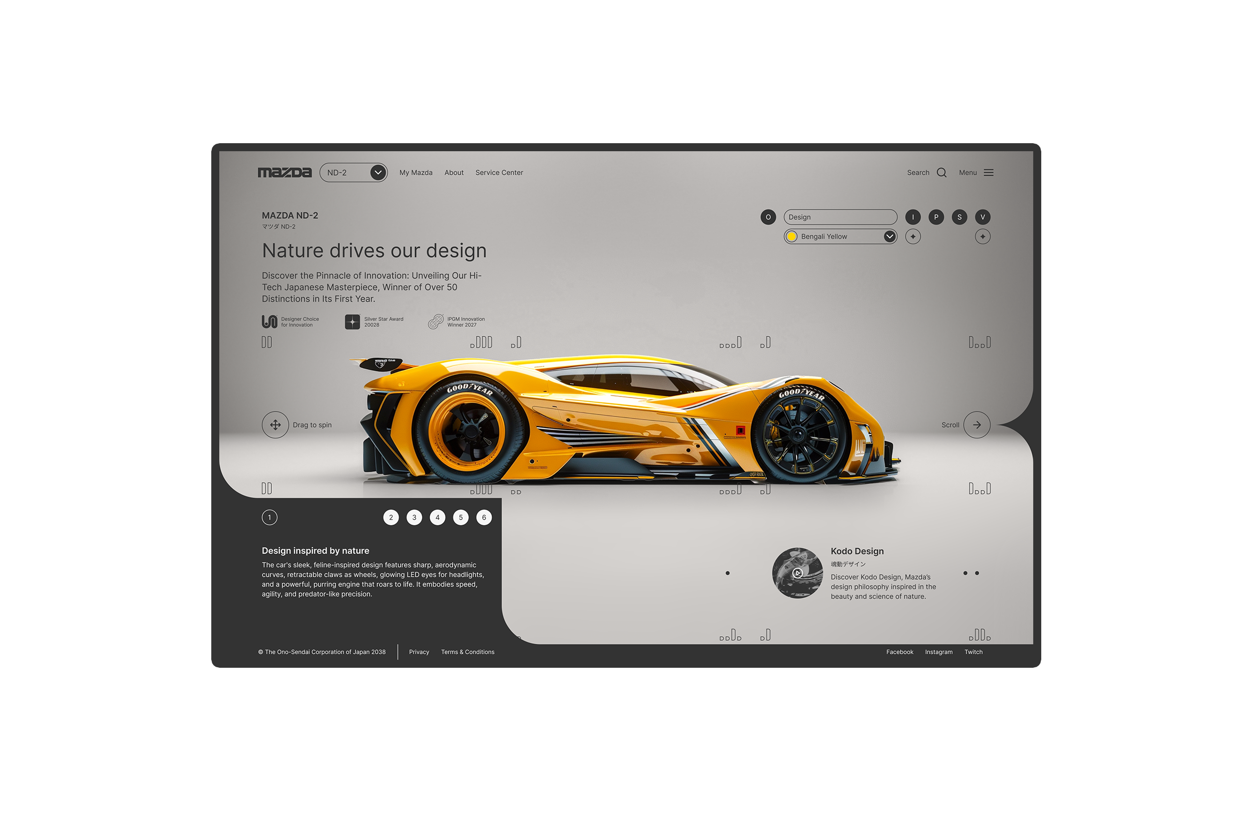
Section 1:
Intro
The vehicle is presented with it's price tag and a main CTA invites to schedule a test-drive. At first, an overlayed button invites to interact with the screen by swiping left and right to rotate the vehicle's image.
At the top of the screen, there is always a dropdown menu to select a different vehicle to view.
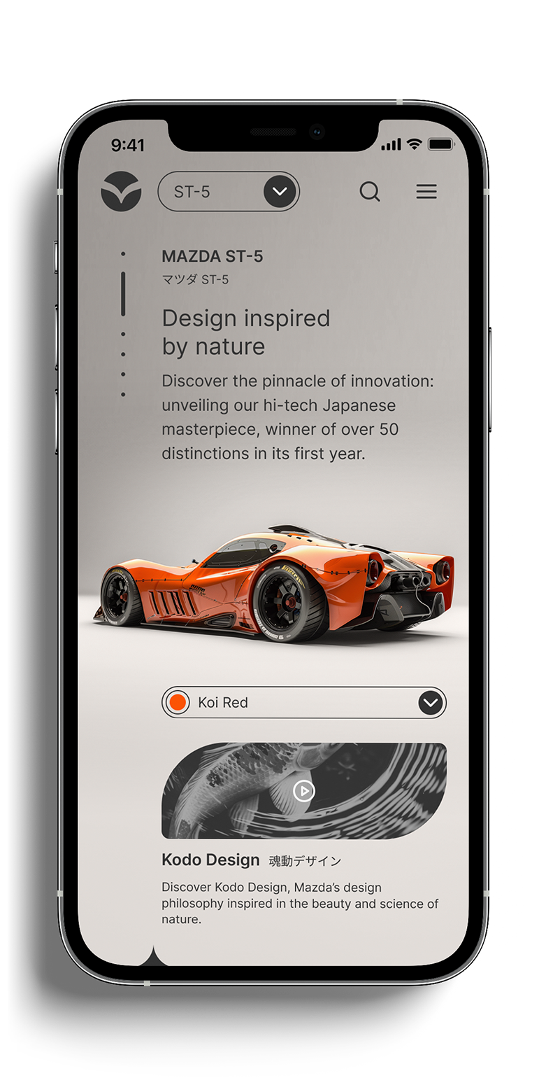
Section 2:
Design
The second section would display the different aspects of the design, such as color options and communicate the design philosophy of Kodo, where the vehicle designs are inspired in nature.
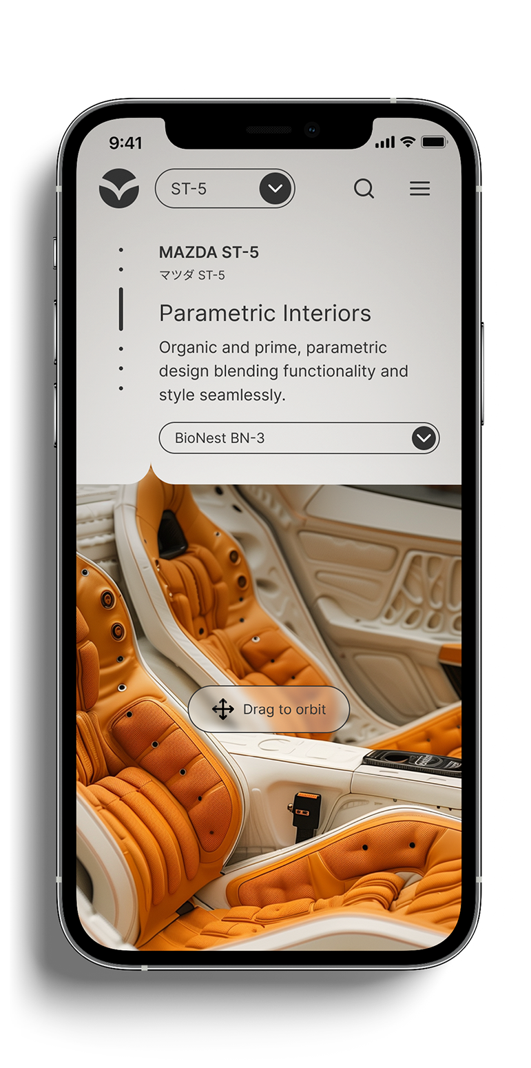
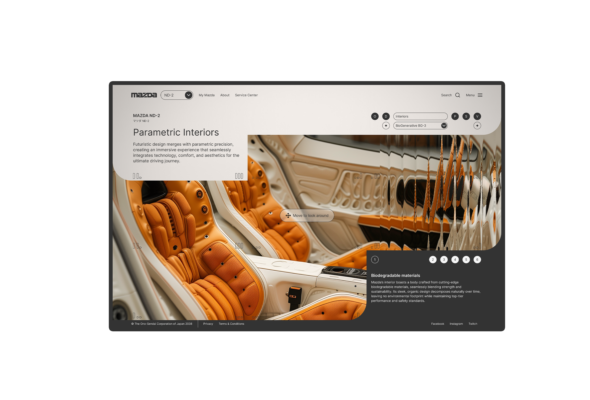
Section 3:
Interiors
When showing the interiors, there's a switch in perspective and the vehicle should be shown from the inside. To achieve this, an underlying layer of imagery is revealed, so that the user experiences the vehicle's interior by orbiting the inside by swiping across the screen.
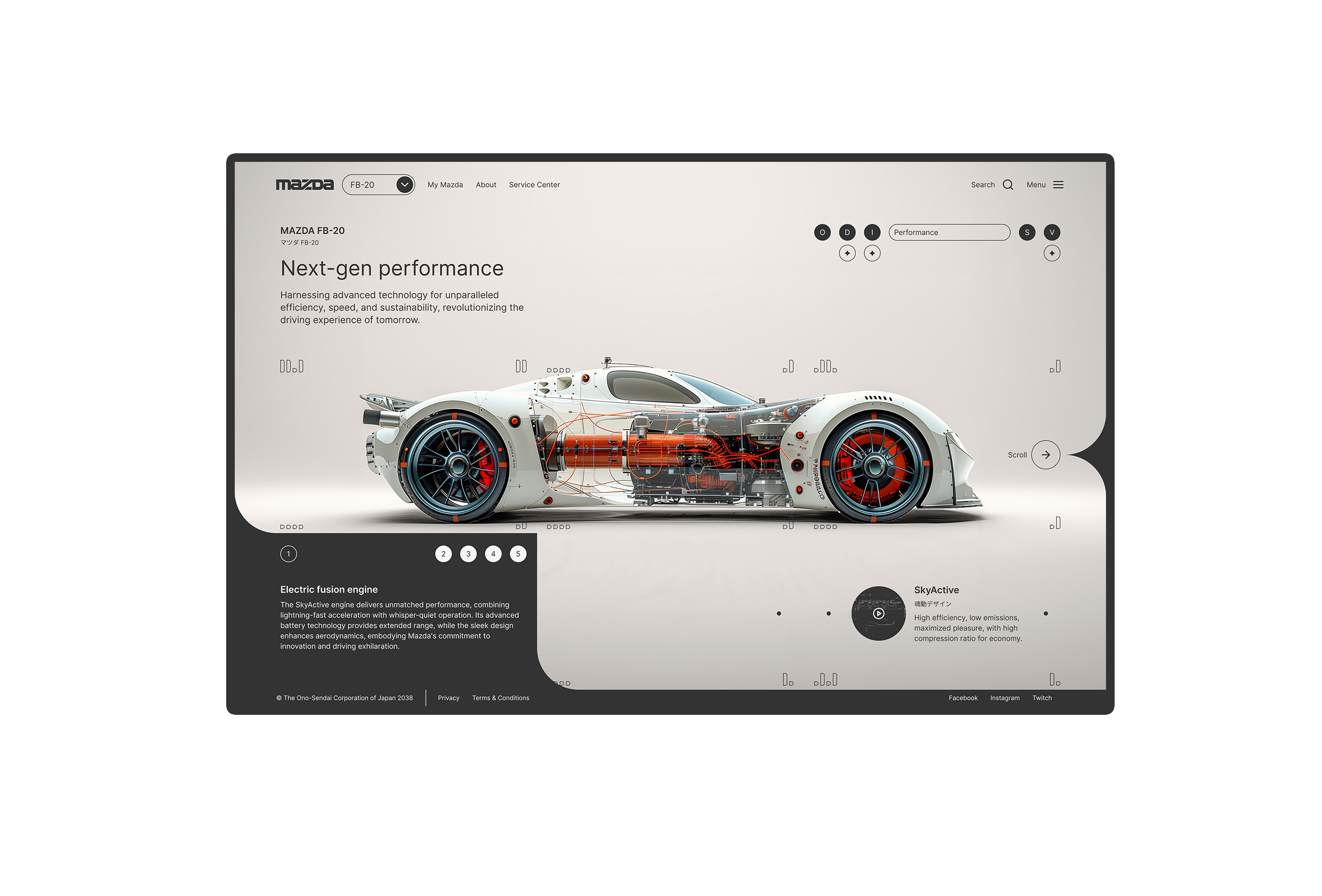
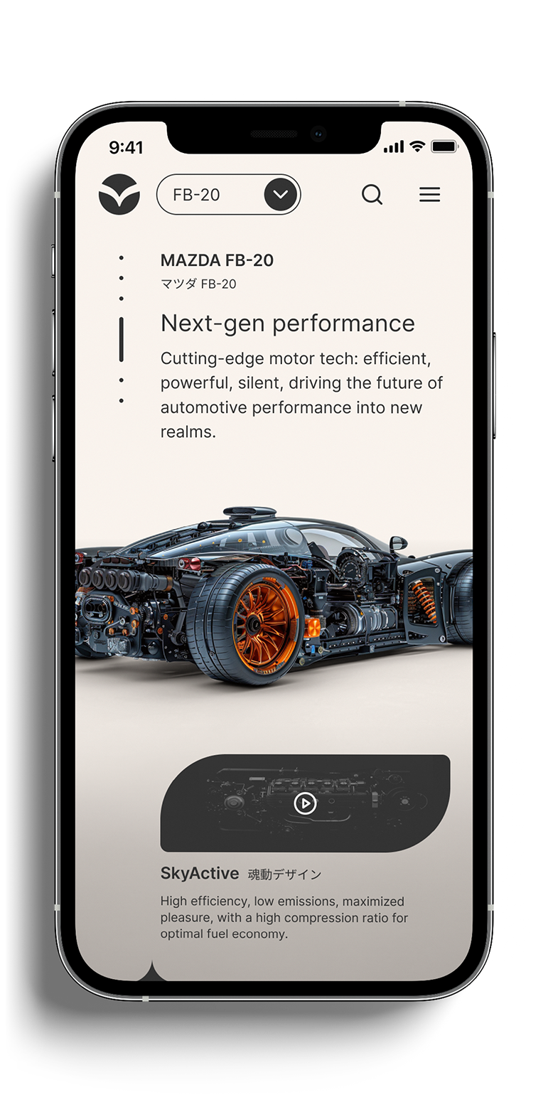
Section 4:
Performance
As users scroll down and return to the vehicle's external view, it's outer layers become transparent to reveal the insides related to performance.
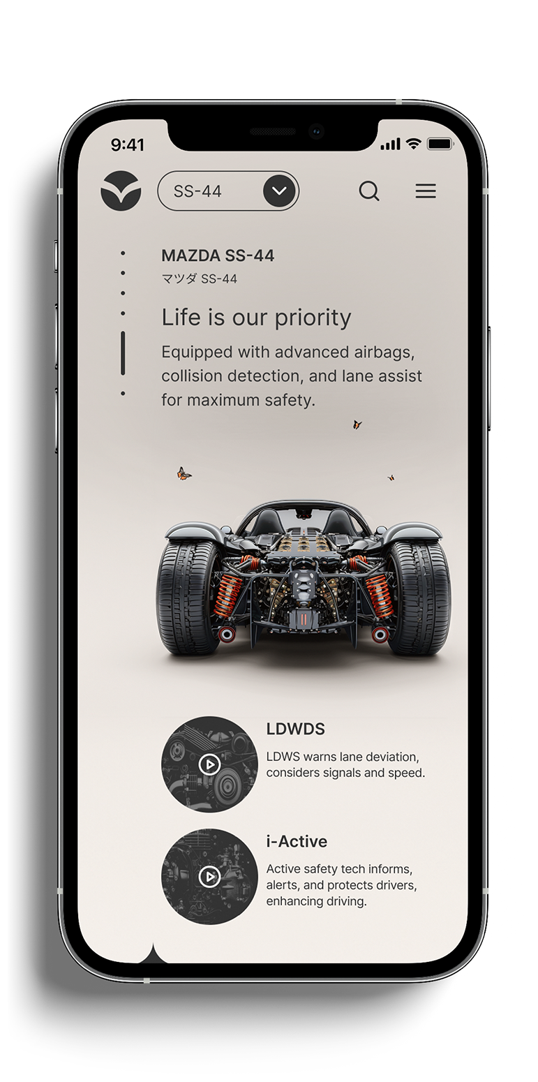
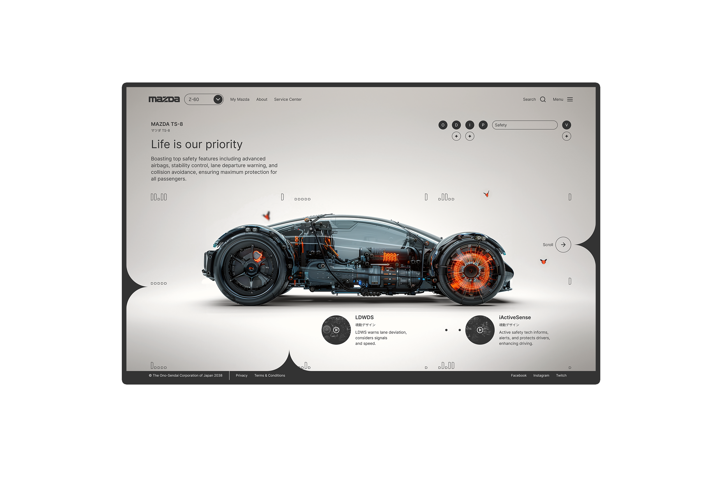
Section 5:
Security
Before approaching the end of the vehicle's information, users are shown features that provide safety. The inside features that provide this safety are also shown and the user can explore these by rotating the vehicle's image.
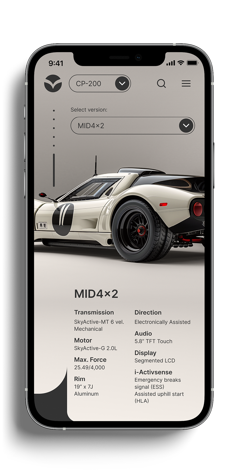
Section 6:
Versions
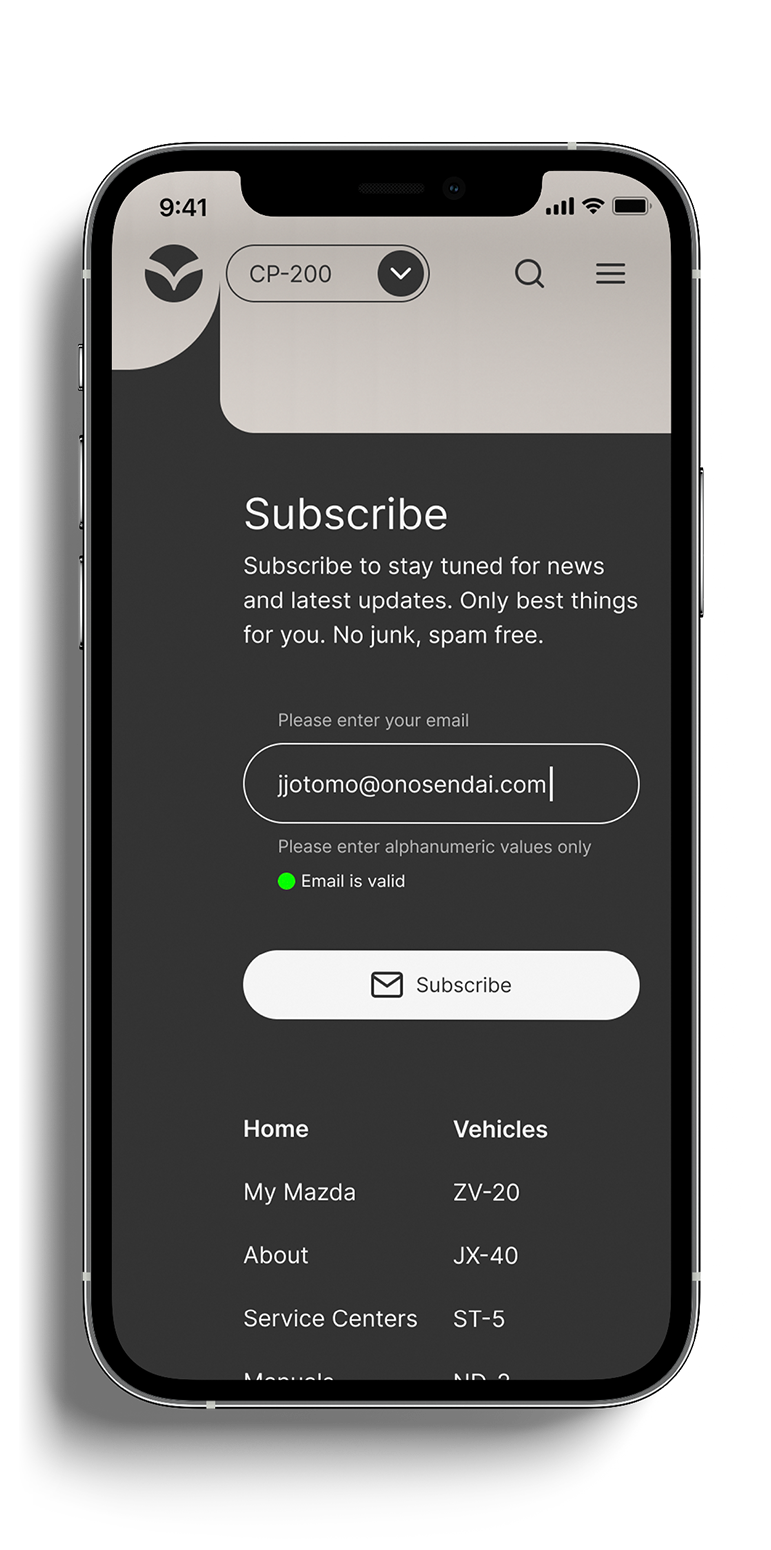
The final section provides users with information regarding the various versions (max. 3) of each vehicle. At the bottom, a footer provides a sitemap, a subscription form and contact information.
Original project time: 1 month
Credits, Resources and Tools
Resources and Tools
Fonts
Good Times, Typodermic at Adobe Fonts. Designed by Ray Larabie. https://fonts.adobe.com/fonts/good-times
Inter, Google Fonts. Designed by Rasmus Andersson. https://fonts.google.com/specimen/Inter
Fonts
Figma. https://www.figma.com
Cavalry. https://cavalry.scenegroup.co
Midjourney. https://www.midjourney.com/home
Adobe Illustrator. https://www.adobe.com
Adobe Photoshop. https://www.adobe.com
Notes and lessons learned from project
Lessons Learned
UI Design
Reduce unnecessary complexity.
There's always a way to solve complex problems, and there's usually a simple way to solve them. In this project, both in it's 2014 and 2024 versions, I've explored different ways of navigating through the information and finding the right balance between what is more complexity and familiarity, and between excitement and the friction to access information. The sooner this is tested in low-res phases, the better.
Made with Semplice and with ❤︎
© 2025 Juan Piñeres