Website
Avianca Airlines
Being one of South America’s largest airlines and definitely Colombia’s most traditional, Avianca Airlines was in need of a new website. The site was to be part of Avianca's strategy for the next five years, at a time where the company was about to celebrate its 100 year anniversary and was undergoing a digital transformation by Accenture.
Avianca's website design was an opportunity to work with a robust Design System and a rigorous process for User Interface Design, also involving all the phases of Design Thinking. A team was assembled from Fjord (a design agency part of Accenture Interactive) brought world-class knowledge to train a newly formed local team which I was part of. From technical aspects to experience in team building, designing Avianca's website became a rich experience across various aspects of product design.
Yeaar: 2018
Client: Avianca Airlines by Accenture
Role: Visual Designer (first and second phase) / Design Lead (third phase)
Results: 15% year-on-year digital sales growth
Link: https://avianca.com
Content update: Aug. 4, 2023
An e-commerce optimized for mobile devices.
The site was designed to be fully responsive so that users could easily book their flights on any type of device, being the standard for airlines worldwide for some time. The previous site, in 2017, was lacking the optimization for fully adapting to mobile devices, severely affecting the company's sales and targets.
UX/UI Website Design Phase (excluding Booking Flow)
UX/UI Design Phase
After having a set of principles and product vision in place, a team of designers worked together to move the re-design of the airline's entire website, from information architecture to the design system and web pages.
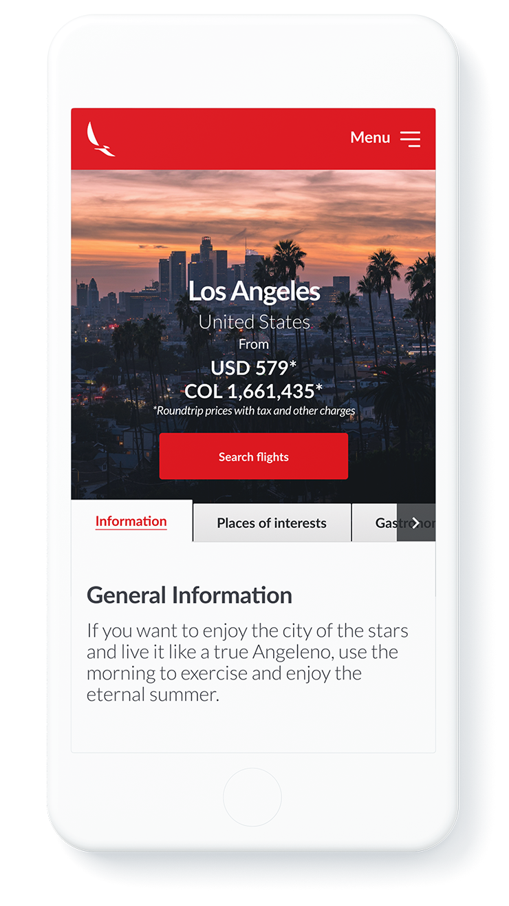
Inspirational Images
As Emotion was another of the UX Design's drivers, inspiring images were defined as a core element in the screen design.
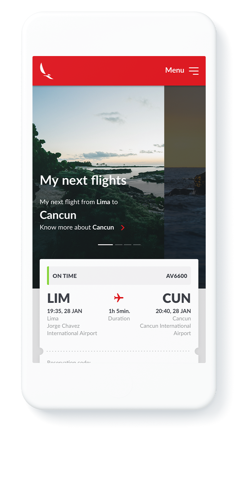
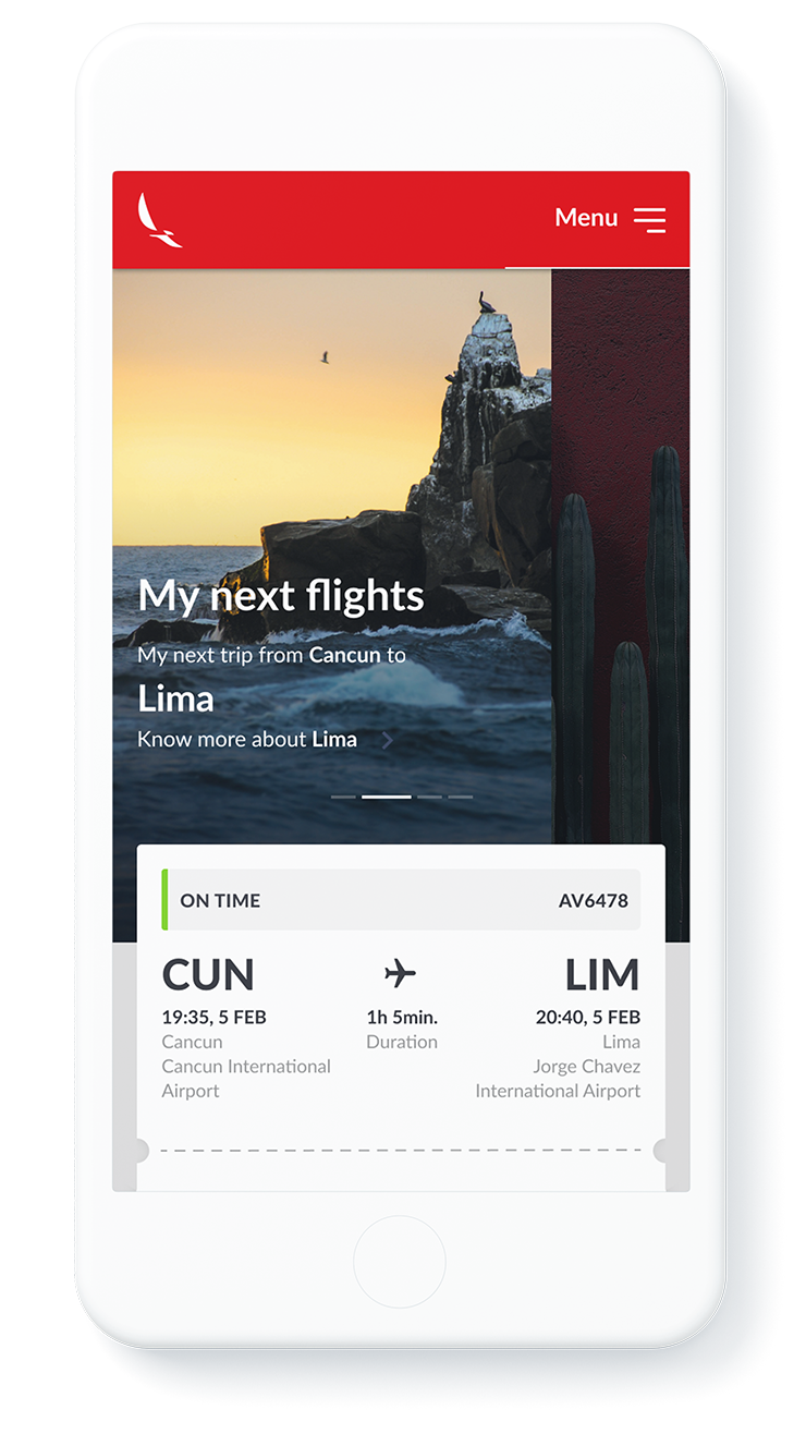
Proactive Travel Information
Travelers were proactively offered basic information regarding the airline's main travel destinations, from recommendations to travel considerations.
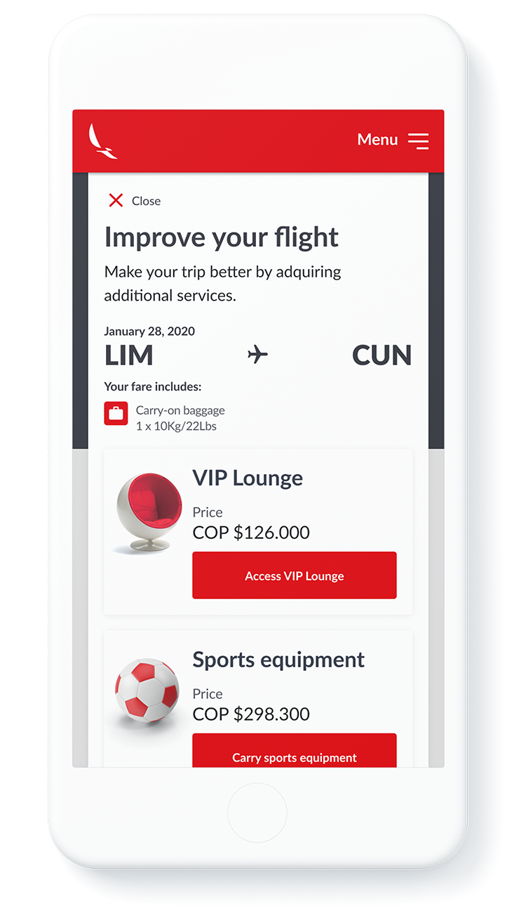
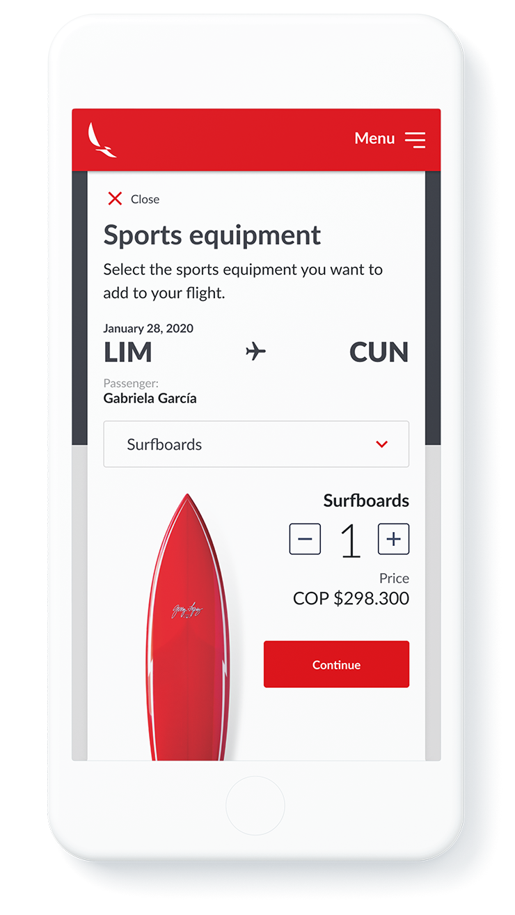
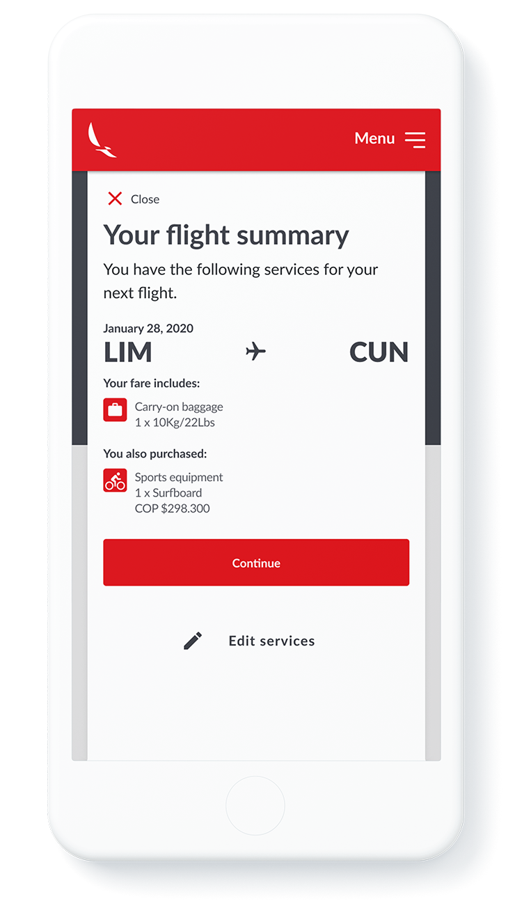
Experience Customization
The opportunity to customize the travel experience was at the core of the company's strategy. All types of services are customizable in the UI.
2+ years.
Credits, Resources and Tools
Teams
Fjord
Jakko Tamela (Design Director), Tim Harris (Service and Interaction Design Manager), Daniel García (Visual Designer), Zeb Reynolds (Visual Designer), Thassya Macedo (Service and Interaction Designer), Diego Carucci (Service and Interaction Designer), Gabriel Gómes (Service and Interaction Designer).
Accenture Interactive
Sergio Martínez (Service and Interaction Design Manager), Carolina Gutierrez (Service and Interaction Design Manager), Javier Quesada (Service and Interaction Designer), Natalia Restrepo (Service and Interaction Designer), Juanita Pardo (Service and. Interaction Designer).
Resources and Tools
Fonts
Lato, Google Fonts. Designed by Łukasz Dziedzic. https://fonts.google.com/specimen/Lato
Fonts
Sketch. https://www.sketch.com
Zeplin. https://zeplin.io
Invision. https://www.invisionapp.com
Adobe Illustrator. https://www.adobe.com
Adobe Photoshop. https://www.adobe.com
Through over 2 years embedded as a consultant in the company, all types of lessons were learned.
Lessons Learned
Workspace
Make the space you work in, work for you.
When collaborating with teams in a defined location such as an office, we should not take for granted the way the space is arranged if it's making the process and results worse. Still, designers have responsibilities and will be held accountable for the results. If the work space is not working, raise your hand respectfully to make adaptations.
Consider turning it around, taking over the walls and windows with post-it notes, print your flows and hang them where possible. Some people might be offended but the results will speak for themselves.
UI Design
Define a ratio or rule for defining spatial hierarchies.
To make the layout work, it's a good idea to define a ratio by which sizes are set. For example, a Fibonacci sequence can be defined so that the different margins (white space) are multiples such as 1x, 2x, 3x, 5x, 8x, 13x, etc... In Avianca Airline's website, this translates into margins of 8px, 16px, 24px, 40px, 64px and 104px.
*Thank you, Daniel García.
Collaboration
Be clear, be specific, write it down.*
In a large and complex project, with teams of designers and stakeholders participating in collaborative methods, it's easy that ideas and findings get lost. To simplify these thoughts and record them, it's a good idea to be clear and specific, and write them down on a post-it note.
*Thank you, Tim Harris.
UI Design
Use 8-pixel baseline grids.
Just like in editorial design, using a baseline grid in a UI Design ensures that there is consistency in the way that margins and paddings are applied. Using multiples of 8 or 4 (such as 8, 16, 24, etc.) has become an industry standard that has proved useful. They are easy to remember by teams and guarantee consistency across all design elements, specially when using Sketch for UI Design.
Made with Semplice and with ❤︎
© 2025 Juan Piñeres