Website
Avianca Airlines
Being one of South America’s largest airlines and definitely Colombia’s most traditional, Avianca Airlines was in need of a new website. The site needed to be part of Avianca's strategy for the next five years, at a time where the company was about to celebrate its 100 year anniversary and was undergoing a digital transformation.
Avianca's website design was an opportunity to work with a robust Design System and a rigorous process for User Interface Design, involving all the phases of Design Thinking. The team that was assembled from Fjord (a design agency part of Accenture Interactive) brought world-class knowledge to train a newly formed team which I was part of. From technical aspects to experience in team building, designing Avianca's website became a rich source of knowledge and upskilling.
Year: 2018
Client: Avianca by Accenture
Role: Visual Designer (first and second phase) / Design Lead (third phase)
Results: 15% year-on-year digital sales growth
Link: https://avianca.com
Content update: 04/08/2023
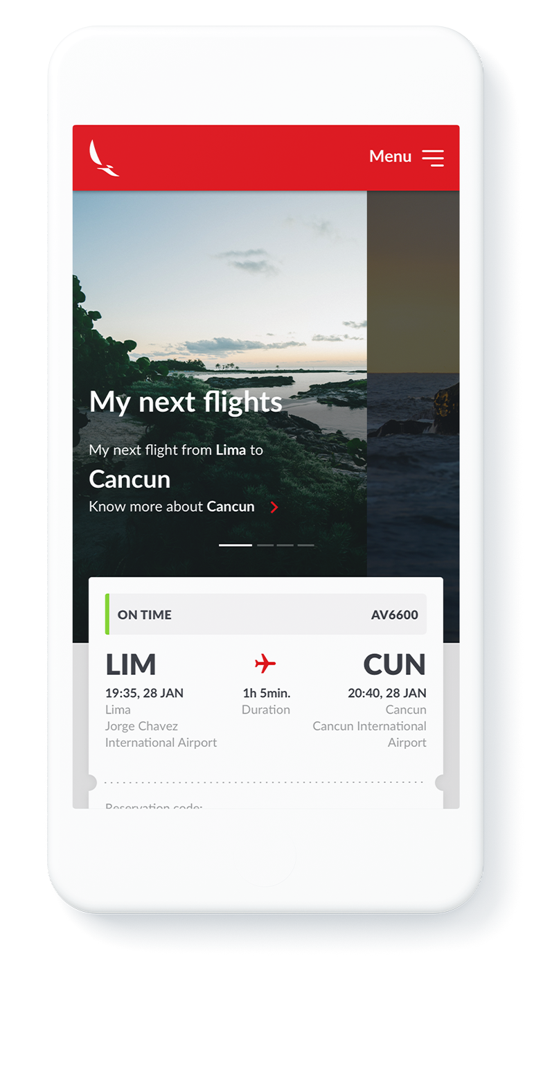
An e-commerce optimized for mobile devices.
The site was designed to be fully responsive so that users could easily book their flights on any type of device, being the standard for airlines worldwide for some time. The previous site was lacking the optimization for adapting fully to mobile devices, severely affecting the company's sales and targets.
*The information displayed in this section is general information that describes typical methods and techniques, and information, that has already been disclosed in public media. The level of ambiguity is intentional.
Discovery Phase*
Before the design team's participation, of which I became part of, there was an initial Discovery Phase that allowed a thorough understanding of travelers and their needs and the opportunities that the company could find and apply to a wide range of touchpoints.
An initial team from Fjord was immersed in a rigurous process of a few months to put together the necessary guidelines for when the design and production phase would start. Not only did the team work on the User Research and other stages of a Design Thinking process but also defined the main design drivers for the Product Design phase: emotive, flexible, informative and proactive.


Research and problem definition
Once an extensive market and User Research was finished the team defined a set of detailed Personas. Each Persona would have their own User Journey, spanning a wide range of touchpoints along the experience. All these different journeys would help map an extensive and detailed Service Blueprint that served as a guide for the company's strategies in the coming years.
Collaborative ideation
Also during this initial phase, there were a series of collaborative activities that would consider various types of stakeholder to gather valuable input. Collaborative Ideation fueled what would become an initial set of documents that included a UI Design Guide with UI elements and patterns as well as the Product Vision.
This way, when the second team arrived, we had a clear understanding of where we should aim the design process at.

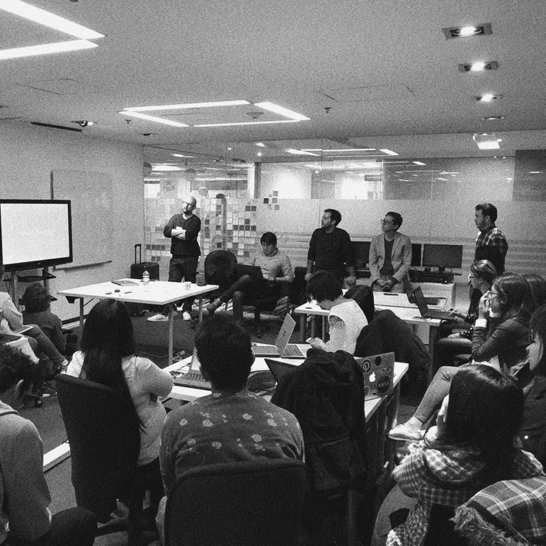
The team
The scale of the project demanded that many teams work together, both consultants and clients. These included Fjord, Accenture Interactive and Avianca's own design teams. Communication and collaboration became key components in the project's success.
The project, being of such a large scale, became the opportunity to enable a new Design Team capacity in Colombia. Thus, demanding initial training from Fjord's team to the locally assembled team.
UX/UI Website Design Phase (excluding Booking Flow)
UX/UI Design Phase
After having a set of principles and product vision in place, a team of designers worked together to move the re-design of the airline's entire website, from information architecture to the design system and web pages.
UX and Ideation Process
One team of Service and Interaction Designers was in charge of the architecture mapping and redefinition. Another team would work on wireframes and a very reduced team of Visual Designer would be working on the UI aspects, defining hi-res designs for three breakpoints (desktop, tablet and mobile).
At this point, because of a challenging time frame, some phases would be blocked out as Black Boxes, to allow for speed. This way, the team could block out the collaborative process and input to produce a starting point that could later be iterated.
Design System
Based on the initial and robust input from the Discovery Phase, a large and componetized Design System was put in place so that the latter design definitions could advance with agility and consistency.

UI Design
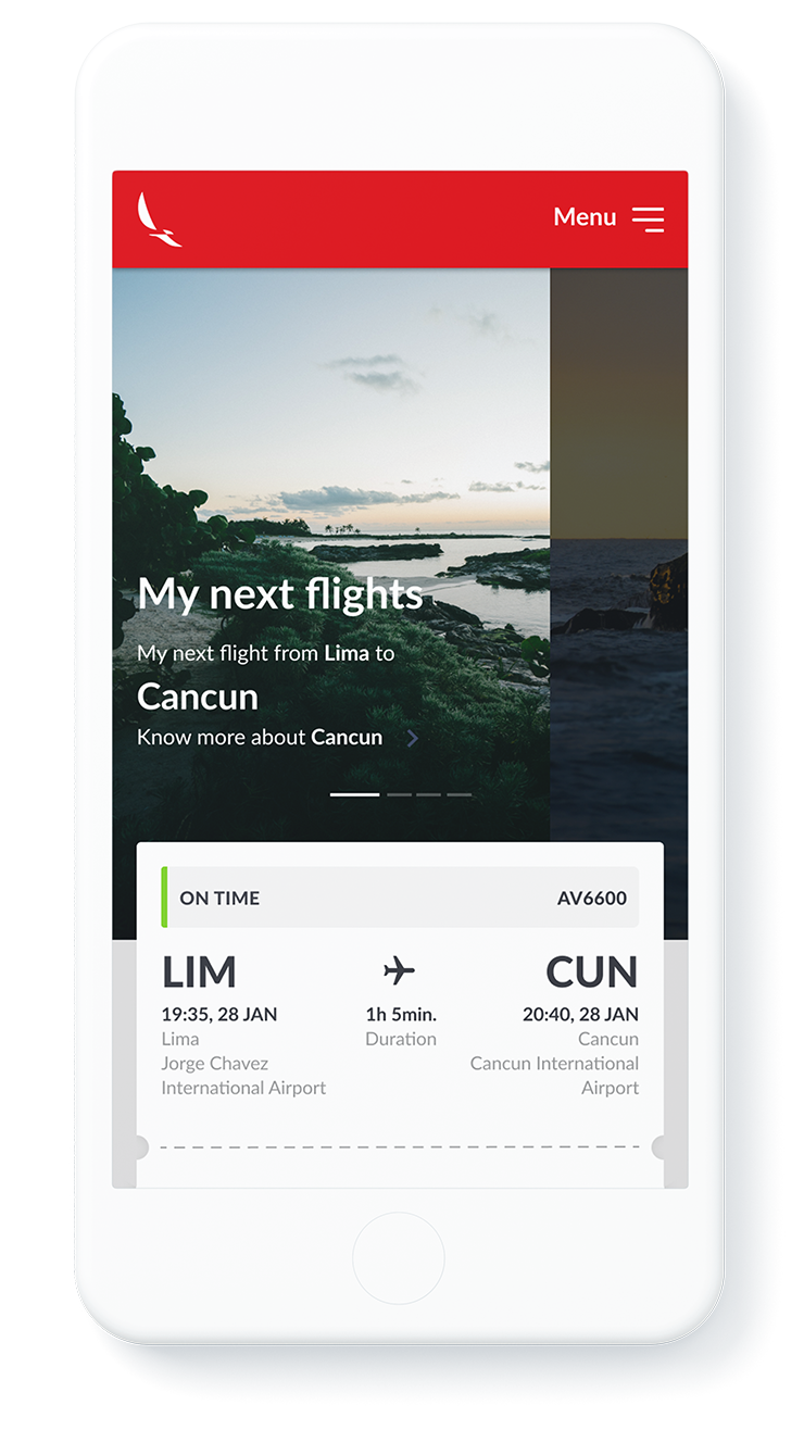
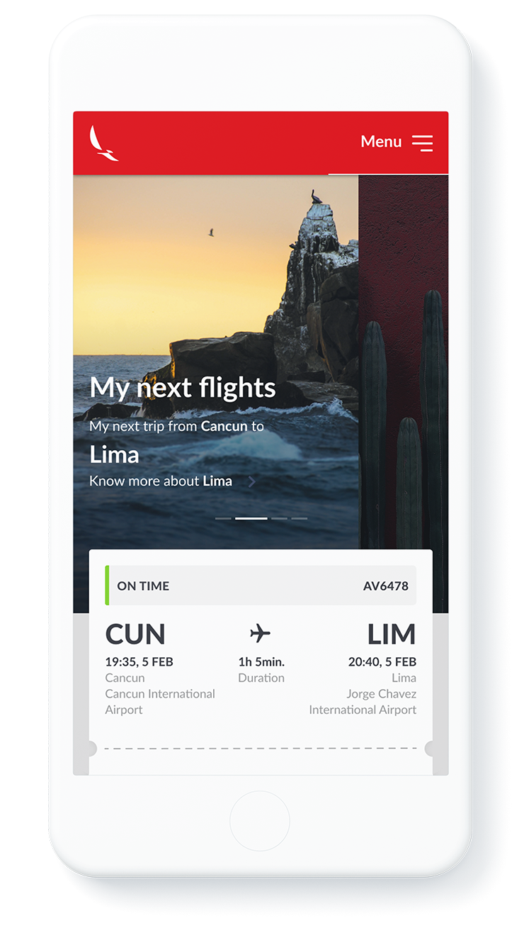
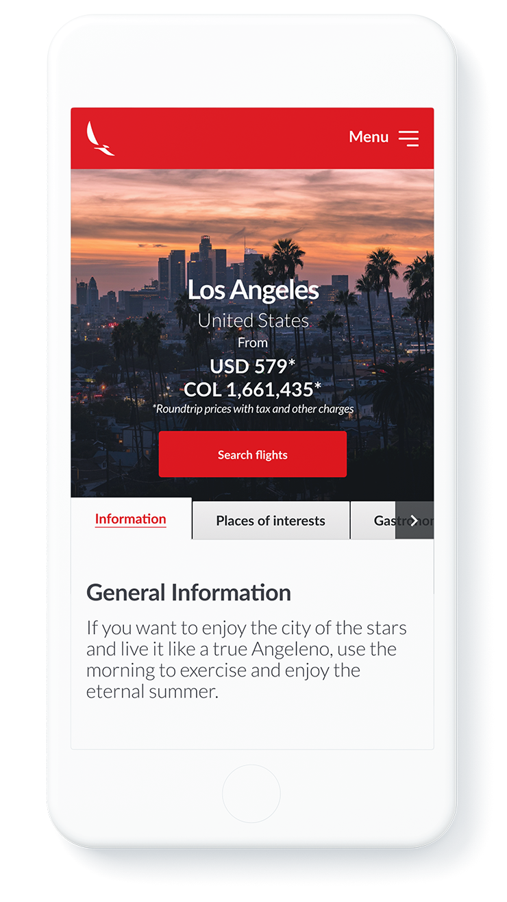
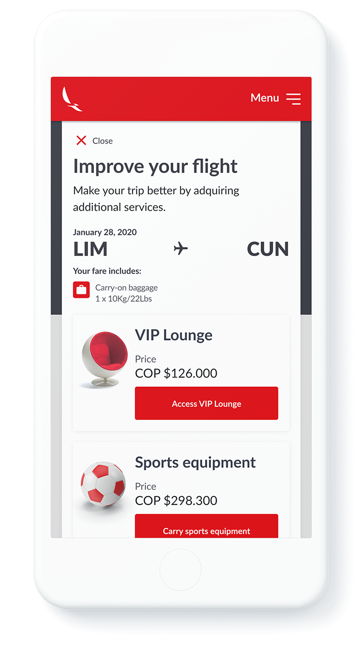
Screens were put together, defining not only the elements that resided in a shared Sketch library but also the team agreed in applying certain practices such as using an 8-pixel baseline grid and multiples of 8 when having to decide the lengths of both UI elements and white space.
Booking Flow 2.0 UI Design Process
Booking Flow 2.0 Phases
As construction of the entire website was underway by the Engineering teams, the booking flow, being so complex, was left out of scope and put in the backlog. However, it's redesign could not wait any further.
Revamping the Booking Flow
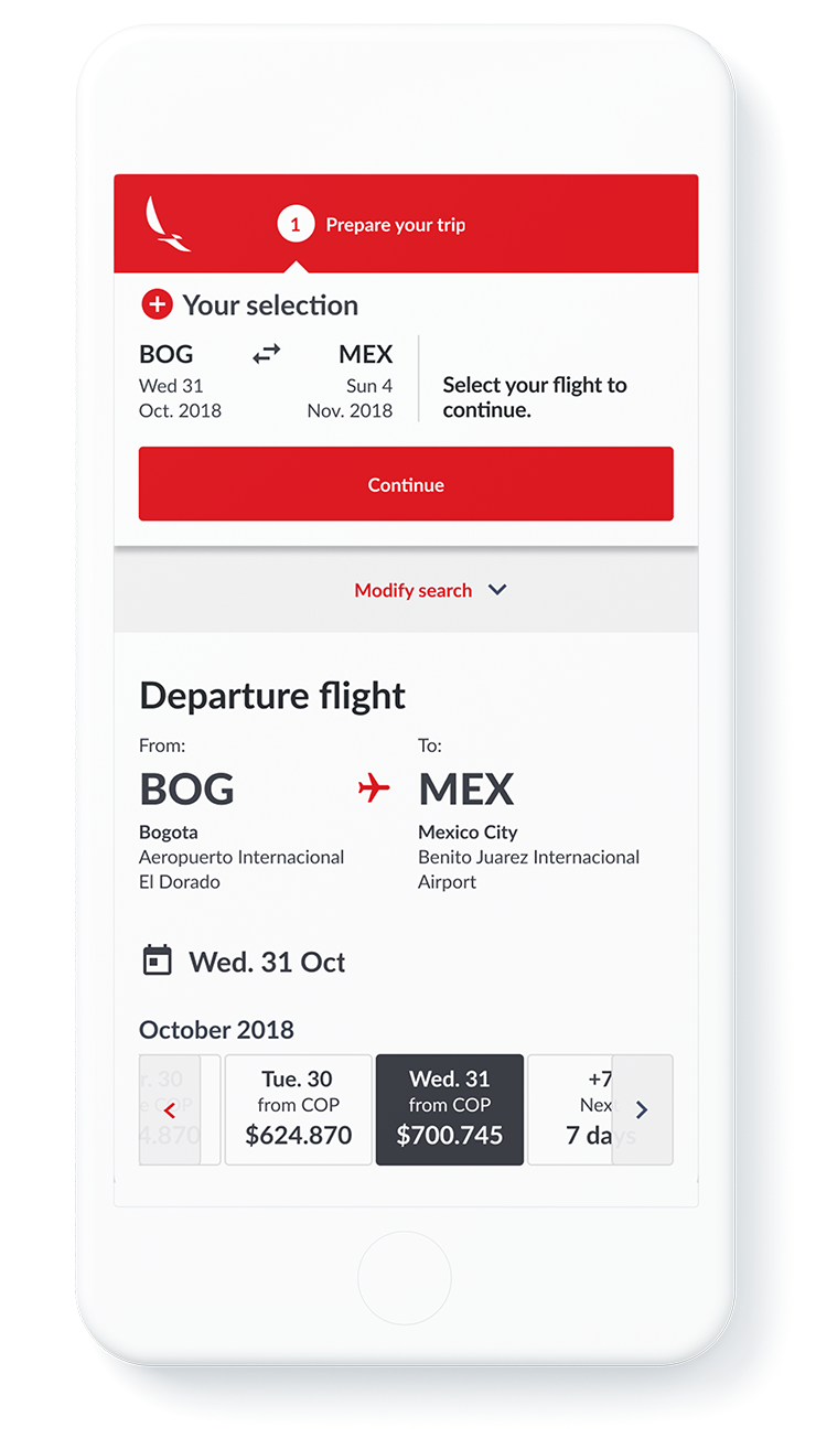
At some point it became imperative to at least revamp the existing structure of the current Booking Flow so that the current functionalities would be optimized for mobile devices.
The Booking Flow was redesigned a few times, responding to a combination of urgency and resources available. These were the different phases:

Phase 1
Research and Vision
A team of five UX and Service Designers put together the work that thouroughly defined how the Booking Flow should be experienced by the different personas. The hand-off was a robust UX deliverable still pending for Hi-fidelity mockups.

Phase 2
Facelift
A small team of three designers mapped the current HTML structure and functionalities of the Booking Flow and defined how it should work, considering a fine balance between the effort and time needed to develop and the enhancements to the experience.

Phase 3
MVP
A designer and an engineer worked together for a week so that by using Adobe Target, the site would be optimized for mobile devices. A more permanent solution would be developed later on. For over six months, this would be the working experience for mobile devices.

Phase 4
Branded Fares
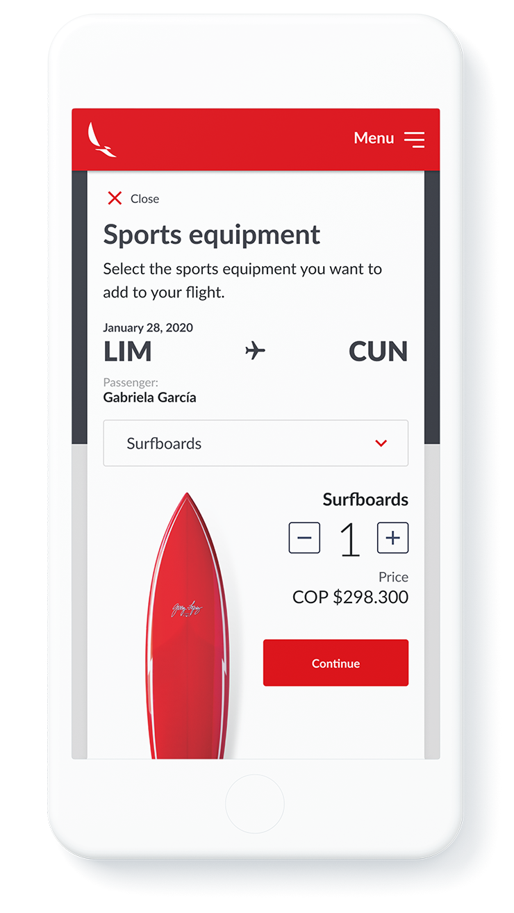
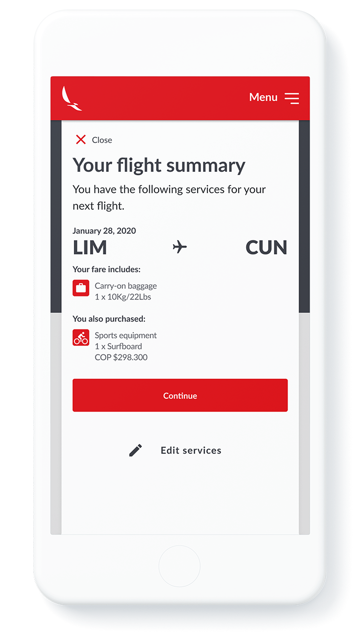
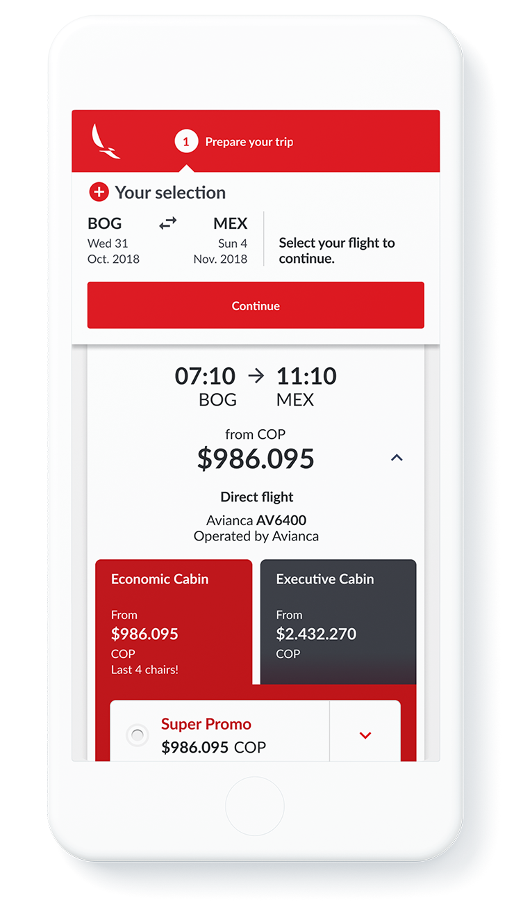
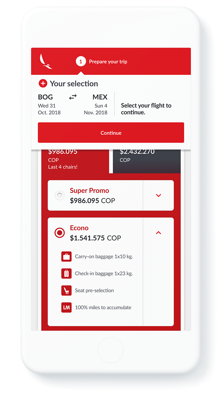
The company then defined a new strategy to offer clients a more tailored and modular experience that they referred to as Branded Fares. This new offering was included into the Booking Flow.

Phase 5
New Booking Flow
Finally, the necessary resources were allocated so that the New Booking Flow, envisioned almost a year before was designed and built.
Phase 4
Branded Fares
Scroll-based Browsing
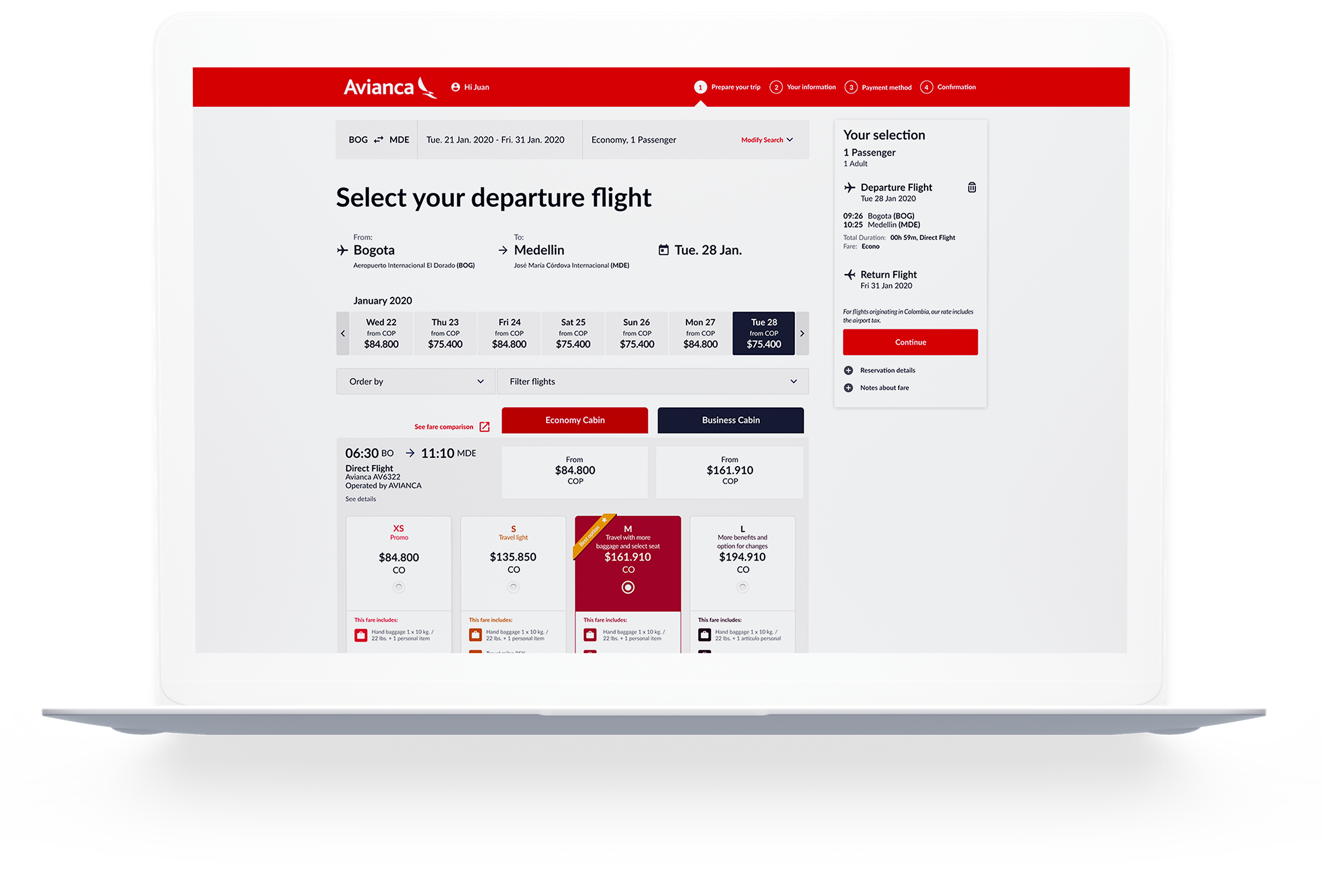
Even though there's more pixel real-estate available in the tablet and desktop versions, there was still the need to apply a scroll-based navigation so that travelers could browse through the different flights available. Also, because of the template being restricted to a grid and not a fluid layout, a large amount of information had to be fitted into the top portion of the page, subtracting valuable space to review the list of available flights.
Overall results and complementary information
*source: www.accenture.com
Results
Overall, both the new website and the new Booking Flow helped boost Avianca's sales as it entered a new chapter of it's century-long story, amidst a complex international and regional context. The results could speak for themselves.
15%
year-on-year digital sales growth*
Credits, Resources and Tools
Teams
Fjord:
Jakko Tamela (Design Director), Tim Harris (Service and Interaction Design Manager), Daniel García (Visual Designer), Zeb Reynolds (Visual Designer), Thassya Macedo (Service and Interaction Designer), Diego Carucci (Service and Interaction Designer), Gabriel Gómes (Service and Interaction Designer).
Accenture Interactive:
Sergio Martínez (Service and Interaction Design Manager), Carolina Gutierrez (Service and Interaction Design Manager), Javier Quesada (Service and Interaction Designer), Natalia Restrepo (Service and Interaction Designer), Juanita Pardo (Service and Interaction Designer).
Resources and Tools
Fonts:
Lato, Google Fonts. Designed by Łukasz Dziedzic. https://fonts.google.com/specimen/Lato
Tools:
Sketch. https://www.sketch.com
Zeplin. https://zeplin.io
Invision. https://www.invisionapp.com
Adobe Illustrator. https://www.adobe.com
Adobe Photoshop. https://www.adobe.com
Notes and lessons learned from project
Lessons Learned
from working in the Avianca Airlines Digital Transformation Project
Workspace
Make the space you work in, work for you.
When collaborating with teams in a defined location such as an office, we should not take for granted the way the space is arranged if it's making the process and results worse. Still, designers have responsibilities and will be held accountable for the results. If the work space is not working, raise your hand respectfully to make adaptations.
Consider turning it around, taking over the walls and windows with post-it notes, print your flows and hang them where possible. Some people might be offended but the results will speak for themselves.
Collaboration
Be clear, be specific, write it down.*
In a large and complex project, with teams of designers and stakeholders participating in collaborative methods, it's easy that ideas and findings get lost. To simplify these thoughts and record them, it's a good idea to be clear and specific, and write them down on a post-it note.
*Thank you, Tim Harris.
UI Design
Use 8-pixel baseline grids.
Just like in editorial design, using a baseline grid in a UI Design ensures that there is consistency in the way that margins and paddings are applied. Using multiples of 8 or 4 (such as 8, 16, 24, etc.) has become an industry standard that has proved useful. They are easy to remember by teams and guarantee consistency across all design elements, specially when using Sketch for UI Design.
UI Design
Define a ratio or rule for defining spatial hierarchies.
To make the layout work, it's a good idea to define a ratio by which sizes are set. For example, a Fibonacci sequence can be defined so that the different margins (white space) are multiples such as 1x, 2x, 3x, 5x, 8x, 13x, etc... In Avianca Airline's website, this translates into margins of 8px, 16px, 24px, 40px, 64px and 104px.
*Thank you, Daniel García.
Health
Stop, breathe and look around.
When in highly complex projects and under a lot of pressure to deliver, some roles in design teams (because some never break a sweat) can be put into such challenging contexts that they focus so much in the work, that they lose the chance to enjoy the process. Leaders are highly responsible for these situations. When the situation seems overwhelming, it's good to stop, take a deep breath, look around and see the big picture.
© 2024 Juan Piñeres
